These are the available UI components for your custom capabilities. Homey will automatically try to find the right component, but you can override this by specifying the uiComponent property in your custom capability.
Toggle
"uiComponent": "toggle"
The toggle component displays one boolean capability. Depending on the capability, the look might change.


Slider
"uiComponent": "slider"
The slider component displays one number capability. Depending on the capability, the look might change.


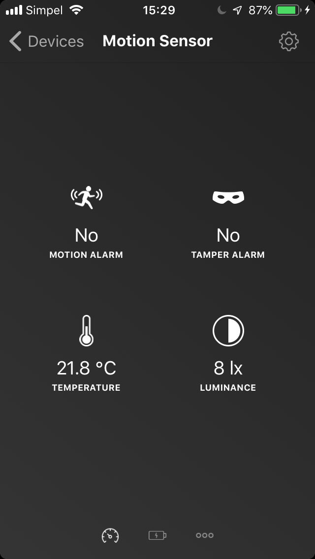
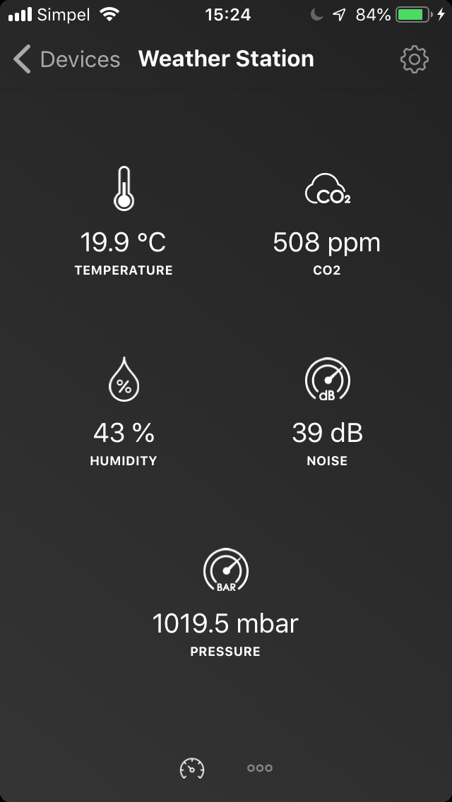
Sensor
"uiComponent": "sensor"
The sensor component displays multiple number, enum, string or boolean capabilities.
Booleans that are true and begin with alarm_ will flash red.
Thermostat
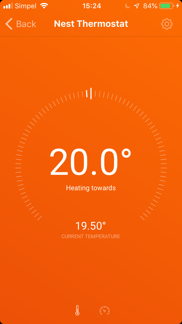
"uiComponent": "thermostat"
The thermostat component displays a target_temperature capability, and an optional measure_temperature.
If you use sub-capabilities for target_temperature and measure_temperature, make sure the dot suffix of the capabilities are the same so that they will be displayed together, for instance: target_temperature.top and measure_temperature.top. This is available as of Homey v5.0.0.
Media
"uiComponent": "media"
The media component accepts the speaker_playing, speaker_next, speaker_prev, speaker_shuffle and speaker_repeat capabilities.
Additionally, it shows the album art as set using Device#setAlbumArt.

Color
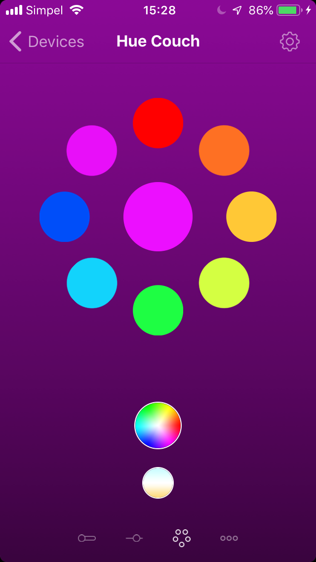
"uiComponent": "color"
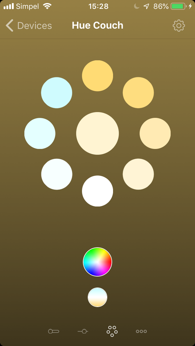
The color component accepts the light_hue, light_saturation, light_temperature and light_mode capabilities.
Battery
"uiComponent": "battery"
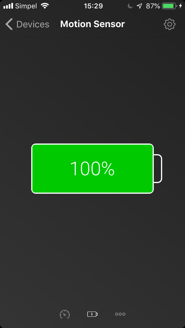
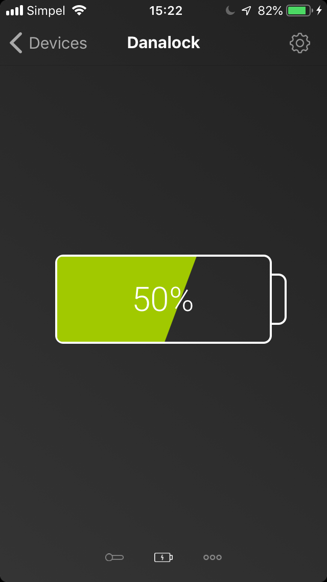
The battery component accepts either a measure_battery or alarm_battery capability.
Picker
"uiComponent": "picker"
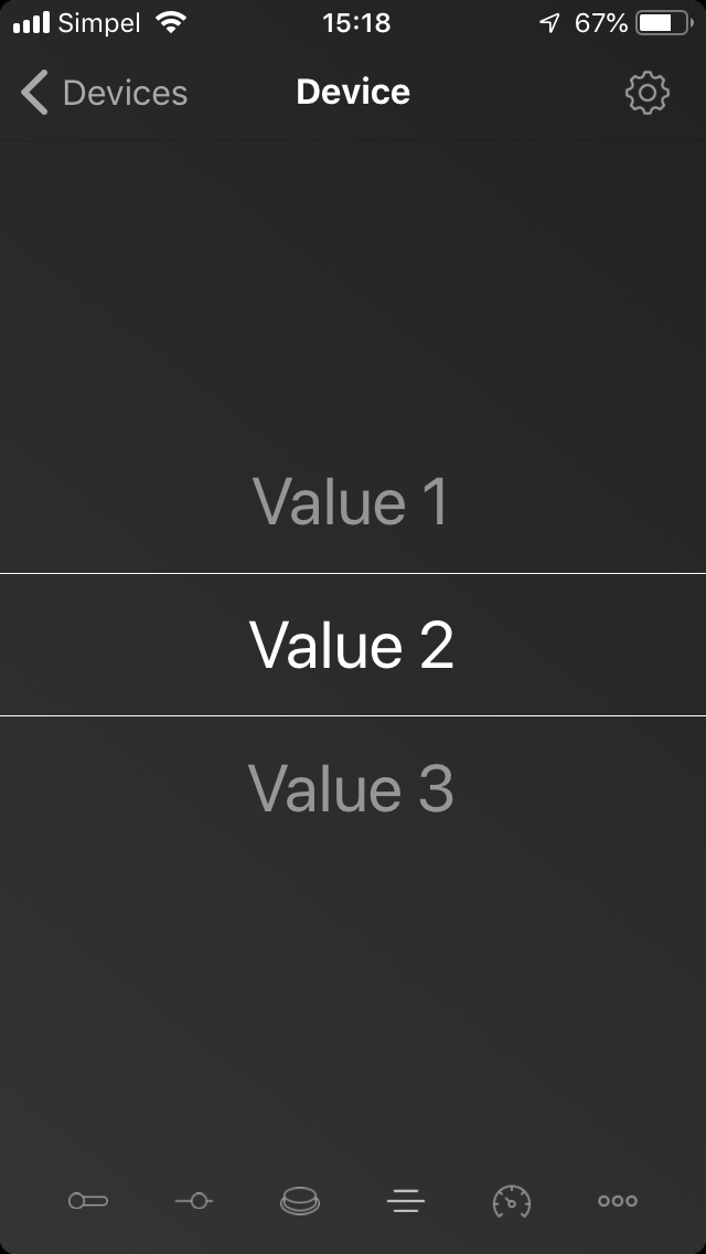
The picker component accepts one enum capability and shows a list of possible values.
Ternary
"uiComponent": "ternary"
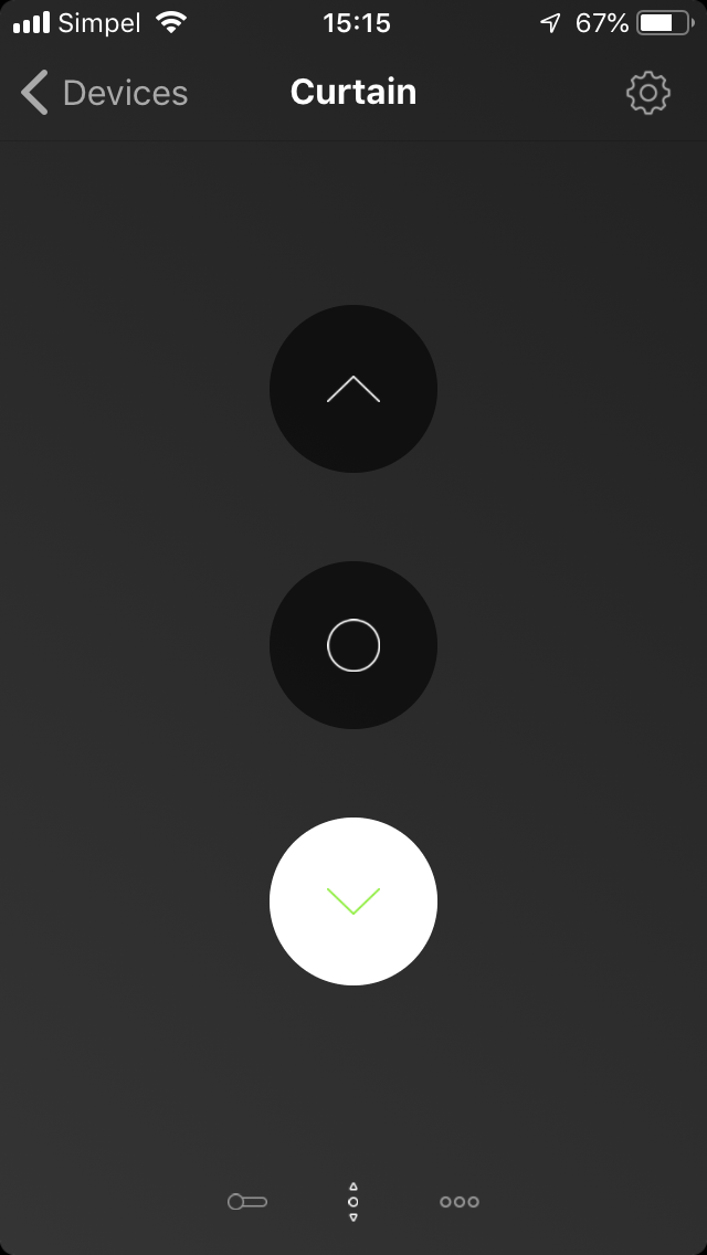
The ternary component accepts one enum capability with three values, meant for motorized components.
No UI component
"uiComponent": null
To hide the UI component, specify null as value.